Monday, March 30, 2015

Project 9 PreWork

Fine Art Portrait Photography


 by Purrington Photography

In this photo I really like the use of the headdress and how unique it makes the photo. I like the shapes and the hard verses soft of the headdress against her skin. I also like the bold colors in her lipstick and makeup and how they compliment the headdress. It is visually breathtaking and I like how her eyes are looking down because it allows the other elements of the photo to shine. 


by Tanneke Photography

I find this photo so beautiful because of the clean colors and the use of her breathtaking eyes. Also, the blur of everything but her face really helps the image. I really like how the props are white, allowing her blue eyes and pink lips to be the stars of the image. I love how her hair is places and how the head scarf is placed. I think it shows her beauty in a very simplistic way.


Commercial Magazine Covers
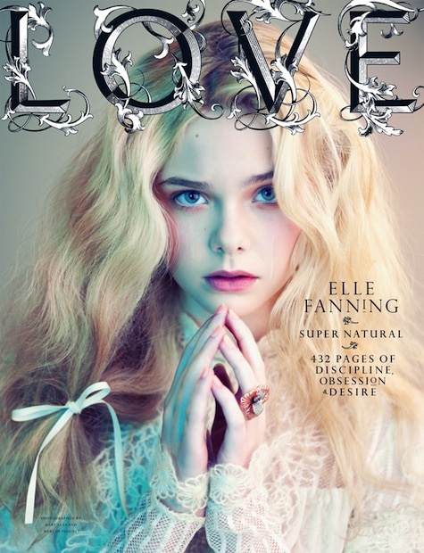


Love Magazine

I love the lighting in this photo, and how half of her is blue and the other half is a pinkish natural color. I love how her hair and hands are used as the main parts of the image and the bow in her hair makes it unique as well. I love this cover because of the use of unique lighting and pose to make it look like not every other cover.


Flare Magazine

I love this cover because of her pose and facial expression, and how it looks high fashion because of the way she is looking. Instead of smiling like in most covers, her face and hair placement looks dramatic and beautiful.


Saturday, March 21, 2015

Project 8


Surrealism and Photomontage


I really liked and found interesting the surrealism images that were creepy and really weird. So for this image, I wanted to give it a creepy and uncomfortable feel, which I did by using different faces and blending them into the bushes. I used four different people for this image and each one has a different opacity and layer filter. I did this to add variation to the image so it looks visually interesting. I thunk this photo demonstrates surrealism because of the weirdness and creepiness of the image. 

For this photo, I wanted to go all out on the weirdness because the surrealisms that stood out to me were the ones that were really crazy. I started out with the photo of the statue as my background. I took a photo of a waterfall and cut out one of the strands of water and duplicated it, and put it coming out of the statue to make it look really weird and unusual. Then I cut out a picture of Aubrey's face wearing a mask and put a dark light filter to make the silver stand out and look creepy. I also turned down the opacity. Then I cut out a picture of a mirror that I took in a garden and added it to the wall. I added Aubrey's face in the reflection of the mirror without the stature to make the image weirder. To make the face look more realistic in the reflection, I used the perspective transformation and turned down the opacity.


Project 8 Pre Work


Surrealism:

"The Surrealist movement was founded in Paris by a small group of writers and artists who sought to channel the unconscious as a means to unlock the power of the imagination."
Time period: 1924-1966

http://www.theartstory.org/movement-surrealism.htm

Major Surrealism movement artists:

Andre Breton (author of 1924 Surrealist Manifesto)
"Figure" (1928)

Max Ernst 
"The Elephant Celebes" (1921)


Cool Surrealism Images I Liked


"Bombs Over Baghdad"
By Oscar Cini


"Stirring Up a Storm"
By Joe Webb


Unknown
By Rosie Hardy


Sunday, March 8, 2015

Alternative processes

Cyanotype

Cyanotype is one of the easier alternative processes, made by a mix of iron compounds.
To make a cyanotype, Potassium ferricyanide and Ferric ammonium citrate are used and mixed seperately with water. Then both substances are mixed together equally. Whatever absorbent material is being used is covered with the mixture and needs to be air dried in the dark. Then the objest or photo being used is placed on the material covered in mixture, and is put under a UV lamp or in the sun. Once the photo is at desired exposure, rinse in water and let dry. This creates a blue background with a white print of the negative or object.

Daguerrotype


 Each daguerreotype is a detailed, photo on a polished, silver-plated sheet of copper, sensitized with iodine vapors, exposed in a large box camera, developed in mercury fumes, and stabilized with salt water. Through this long and intricate process, Iodine fumes react with silver causing a color shift in the plate.

Gum Bichromate

A mixture of gum arabic, a dichromate, and pigment is mixed together and spread on a canvas. The negative is placed on top of the canvas and put under the sun or a UV lamp. A sheet of glass is put over the negative in order to ensure that the negative is constantly touching the mixture on the canvas. Finally the canvas is put in a series of water baths and dried. This process creates vivid colors in the image.


http://www.metmuseum.org/toah/hd/dagu/hd_dagu.htm
http://www.alternativephotography.com/wp/processes/daguerrotypes/becquerel-daguerreotype
http://www.alternativephotography.com/wp/processes/gum-bichromates/an-introduction-to-the-gum-bichromate-process

Tuesday, March 3, 2015

Project 7


Cyanotype

Before & After


I really like this image because of the unique landscape and the contrast between the water, the buildings, and the bridge. I also like the difference in scale that this image shows. I made this photo a cyanotype because I like the kindof calm but a little eerie mood it gives the photo, and how the faded out edges give it the feel of an old photograph. I used a more see through paint brush for the overlay to give it this sheer and faded feel on the edges, and made the blue darker to fit the mood of the photo.


Second cyanotype
I chose this as my second cyanotype because I thought it was a good subject matter. Many times cyanotypes are done on flowers/leaves and they are very cool so I thought I would try one of those. I chose a much lighter blue for this one to make the leaves stand out in a lighter color but to have the berry bundles darker. 


 Gum Bichromate

Before & After
I really love how this gum bichromate turned out. I used the more advanced process, where you change the yellow, magenta, and cyan color in the image and then paint over the layers. I also added a darken layer and a lighten layer to the image. I really love this image because the normal photo is fine, but in the gum photo you can distinctly see the different colors that were changed and it is just so much more visually interesting and unique. Each of the colors stands out while not being tacky, which I really like. Overall I enjoyed making this photo and will probably make more of these in the future.


Daguerrotype

Before and after
What I really loved about this image is the mood that the original has. I asked myself which of these techniques would best enhance this mood and the daguerrotype definitely was the one. The sad and lonely image of this homeless man sitting by himself overlooking the water was the perfect one to do this on. I used a more light brush so that instead of harsh lines jutting out the side of the image, there is a frayed feel almost like it is on paper. I made rhis a mid-dark brown so that every part of the image was still visible while also enhancing the sad mood. I really like how this image turned out and how it looks like an old daguerrotype photograph.


Second daguerrotype

Before & After

I also really like this daguerro because the dark brown color reflects off the water and enhances the background. Also, the water behind the two people is light, and their color is dark, so it really pronounces them in the photo and even though they are the smallest thing in the picture, they stand out. The frayed edges add to the feel of the photo and I think it is a very visually interesting daguerrotype.